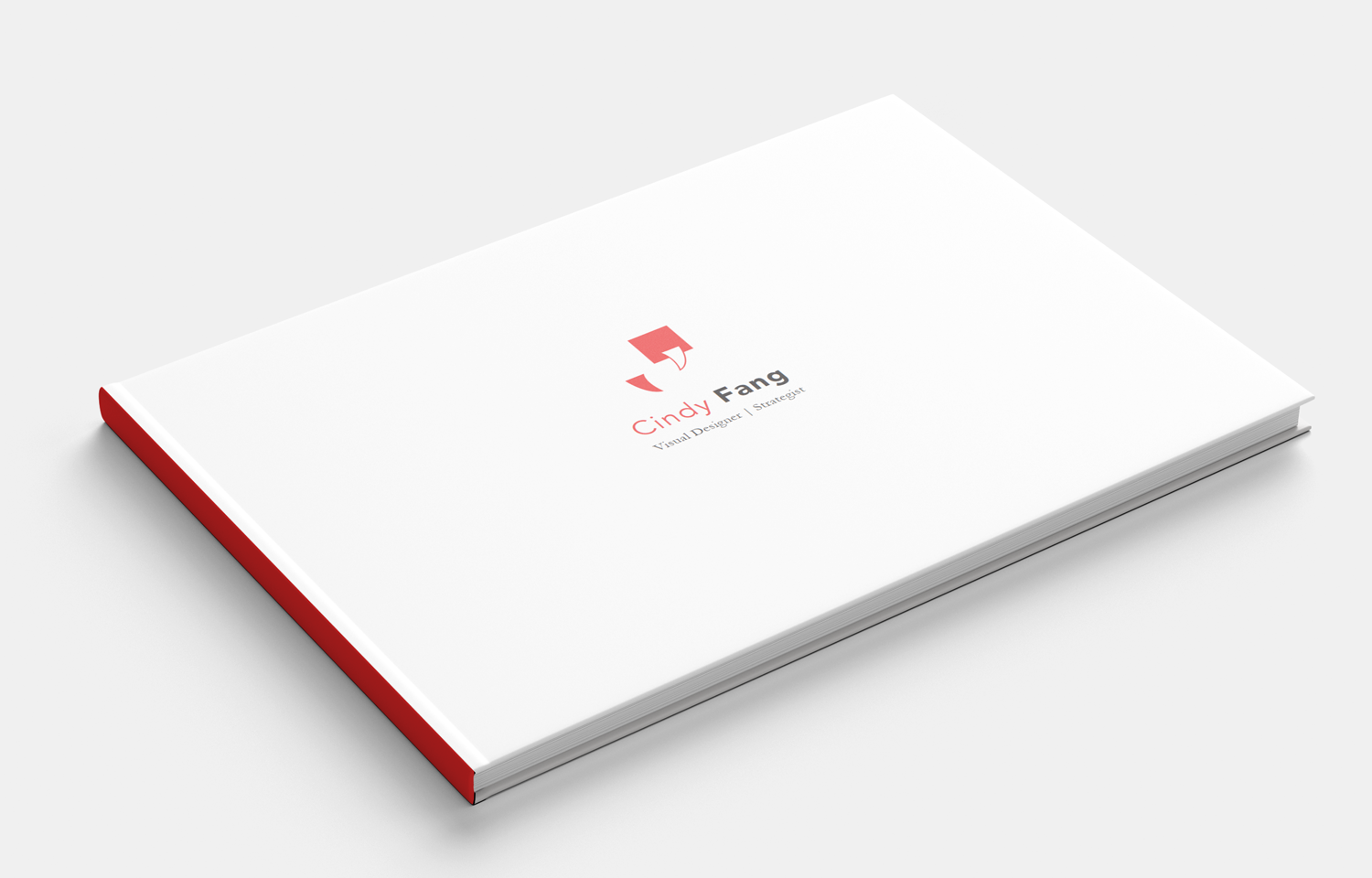
Cindy Fang is my personal brand. I try to combine both American and Chinese identities into the design. Fang in English means teeth but in Chinese means square and it pronounce “Fong”. At the same time, I try to express my own personalities within the design: Friendly and enthusiastic. The right side of the logo image reflects a dialog box look, which express that I am easy to talk with and love to share any interesting conversations. I use vivid colors to display enthusiasm and the colorful side of my personality.
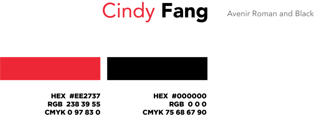
Typeface and Color


Takeaway cards


